Visualizing Data in QGIS:
Basics of Styling & Symbolology
- Layer Properties
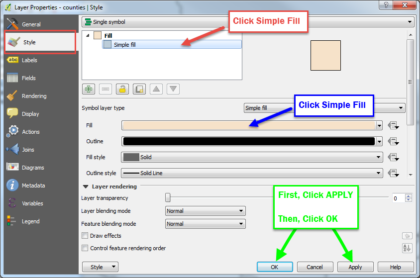
- Double-click the counties layers
- View layer information under different tabs at left
- On the Style tab, click Simple fill, then, under Symbol Lyer Type, choose a pretty Fill color
- Click “Apply”… You must click “Apply before clicking “OK” or changes won’t take

Explore the possiblities! QGIS has a very handy Color Picker tool, too.
Create a Table Join
- Add the Boulder_Co_Tracts.shop layer from the workshop data folder
- Next, add the Coulbder)Co)MHHI.csv file from the workshop data folder (this is US Census income data)
- Now we must merge the attribute table of the Bopulder census tracts layer with the CSV table of median household income.
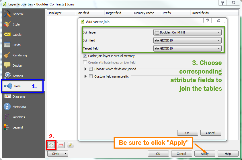
- Double click the Boulder_Co_Tracts layer to open layer properties
- On the Joins tab, click the green plus button to create a new join:

- In the Add Vector Join dialog box, under Join layer, choose Boulder)Co)MHHI, then choose GEOID10 under both the Join and Target fields*
- Click OK, then Apply, then OK. Open the Boulder_Co)Tracts attribute table to ensure the join occurred (right click the layer > Open Attribute Table)
*To join (aka merge) a data table to a vector layer’s attribute table, there must be corresponding identical fields in both tables—lucky for you, we prepared this data ahead of time!

Make a Choropleth map
Now that the income data has been added to the census tract layer, we can symbolize each tract based on median household income!
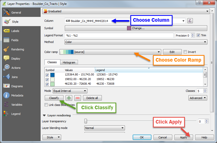
- Open the Boulder_Co_Tracts layer properties
- On the Style tab, choose Graduated

- For Column, choose Boulder_Co_MHHI_MHHI2014
- For Color Ramp choose a scheme that suits your fancy…
- Click Classify
- Click Apply!

You made a choropleth! Nice work!