Close Trinket
Bigger
Introductory Python for Humanists + Data Visualization
Last Updated: May 1, 2020
1) Start a new Trinket project
1.1) You can either use the embedded trinket on the right side of this page
or work in a new tab at trinket.io/python3 .2) Test out the trinket
2.1) Write the following in the trinket editing tab under "main.py":
print("hello world")
2.2) Run your code by pressing the play button at the top. In the result box, you should get hello world .
print(2+2)
3) Create variables
3.1) Create a string variable:
greeting = "hello"
print(greeting)
3.2) Concatenate strings:
greeting = "hello, "
animal = "puppies!"
mySentence = greeting+animal
print(mySentence)
3.3) Create a float variable:
myNumber = 3.14159
print(myNumber)
print(myNumber + 10)
3.4) Create an array:
myArray = [1,2,3,4,5]
print(myArray)
4) Write an If block
4.1) Test if two numbers are equal:
myFirstNum = 5
mySecondNum = 10
if (myFirstNum == mySecondNum):
  print("My numbers are equal.")
else:
  print("My numbers are not equal.")
4.2) Try changing the values of myFirstNum and mySecondNum to make sure the test works.
5) Write a For loop
myArray = [2,4,5,9,14]
for i in myArray:
  print(i+1)
6) Now let's start a scatter plot
6.1) Import two useful python libraries:
import numpy as np
from matplotlib import pyplot as plt
6.2) Add some data:
import numpy as np
from matplotlib import pyplot as plt


data_x = [2,4,5,9,14]
data_y = [3,3,6,8,10]
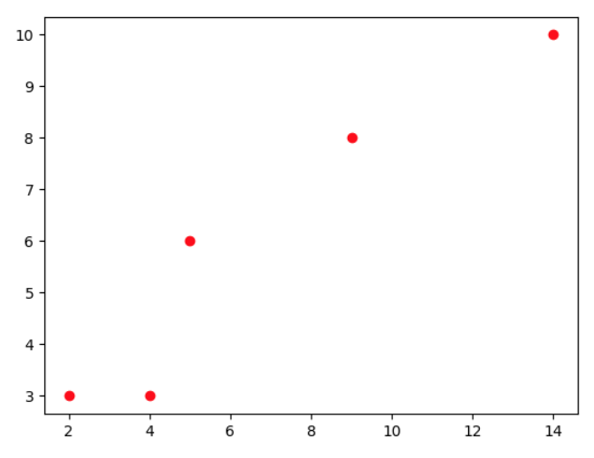
6.3) Plot the data points:
import numpy as np
from matplotlib import pyplot as plt

data_x = [2,4,5,9,14]
data_y = [3,3,6,8,10]

plt.plot(data_x,data_y, 'ro')
plt.show()
The output should look like this:
import numpy as np
from matplotlib import pyplot as plt
data_x = [2,4,5,9,14]
data_y = [3,3,6,8,10]
plt.plot(data_x,data_y, 'ro')
fit = np.polyfit(data_x,data_y,1)
fit_fn = np.poly1d(fit)
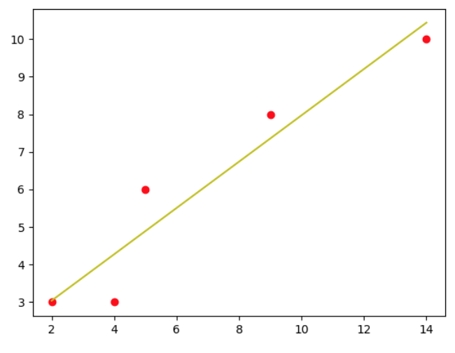
plt.plot(data_x, fit_fn(data_x), 'y-')
plt.show()
The output should look like this:7) Add some lables to your plot
7.1) Add a title:
import numpy as np
from matplotlib import pyplot as plt

data_x = [2,4,5,9,14]
data_y = [3,3,6,8,10]

plt.plot(data_x,data_y, 'ro')
fit = np.polyfit(data_x,data_y,1)
fit_fn = np.poly1d(fit)
plt.plot(data_x, fit_fn(data_x), 'y-')

plt.title('My Awesome Data Viz')

plt.show()
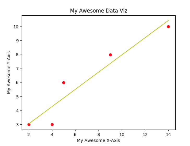
7.2) Add lables to the X and Y axes:
import numpy as np
from matplotlib import pyplot as plt

data_x = [2,4,5,9,14]
data_y = [3,3,6,8,10]

plt.plot(data_x,data_y, 'ro')
fit = np.polyfit(data_x,data_y,1)
fit_fn = np.poly1d(fit)
plt.plot(data_x, fit_fn(data_x), 'y-')

plt.title('My Awesome Data Viz')
plt.xlabel('My Awesome X-Axis')
plt.ylabel('My Awesome Y-Axis')

plt.show()
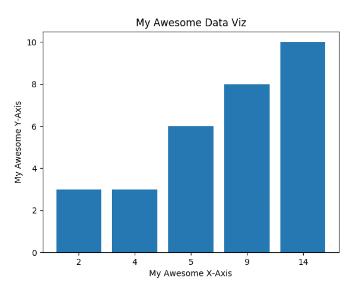
Your plot should now look like this:8) Make a Bar Chart
8.1) Delete the lines creating your scatter plot:
import numpy as np
from matplotlib import pyplot as plt

data_x = [2,4,5,9,14]
data_y = [3,3,6,8,10]

plt.title('My Awesome Data Viz')
plt.xlabel('My Awesome X-Axis')
plt.ylabel('My Awesome Y-Axis')

plt.show()
8.2) Display your data as a bar chart:
import numpy as np
from matplotlib import pyplot as plt

data_x = [2,4,5,9,14]
data_y = [3,3,6,8,10]

x_pos = np.arange(len(data_x))
plt.bar(x_pos,data_y)
plt.xticks(x_pos, data_x)

plt.title('My Awesome Data Viz')
plt.xlabel('My Awesome X-Axis')
plt.ylabel('My Awesome Y-Axis')

plt.show()
Your result should look like this:
import numpy as np
from matplotlib import pyplot as plt

data_x = [2,4,5,9,14]
data_y = [3,3,6,8,10]
data_y2 = [1,2,3,5,5]

x_pos = np.arange(len(data_x))
plt.bar(x_pos,data_y)
plt.bar(x_pos,data_y2)

plt.xticks(x_pos, data_x)

plt.title('My Awesome Data Viz')
plt.xlabel('My Awesome X-Axis')
plt.ylabel('My Awesome Y-Axis')

plt.show()
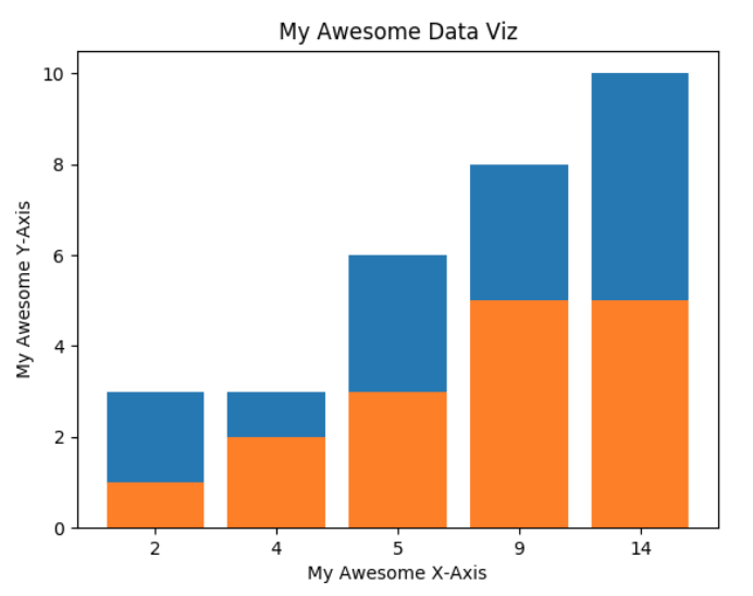
Your result should look like this:
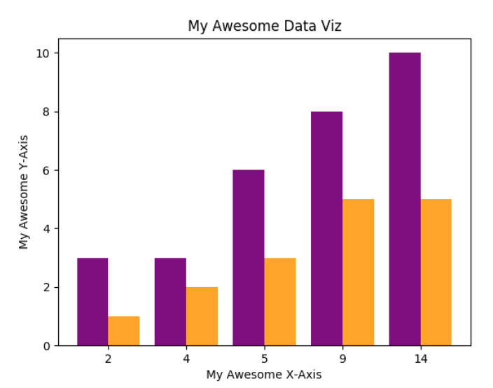
import numpy as np
from matplotlib import pyplot as plt

data_x = [2,4,5,9,14]
data_y = [3,3,6,8,10]
data_y2 = [1,2,3,5,5]

x_pos = np.arange(len(data_x))
plt.bar(x_pos-.2,data_y, width=.4, color="purple")
plt.bar(x_pos+.2,data_y2, width=.4, color="orange")

plt.xticks(x_pos, data_x)

plt.title('My Awesome Data Viz')
plt.xlabel('My Awesome X-Axis')
plt.ylabel('My Awesome Y-Axis')

plt.show()
Your result should look like this:9) Make a Pie Chart
9.1) Delete the data, the lines creating a bar graph, and the x and y axis lables:
import numpy as np
from matplotlib import pyplot as plt

plt.title('My Awesome Data Viz')

plt.show()
9.2) Add lables and percents as arrays:
import numpy as np
from matplotlib import pyplot as plt

lables = [A,B,C,D]
percents = [33.3,22.2,16.7,5.6,22.2]

plt.title('My Awesome Data Viz')

plt.show()
9.3) Make a pie chart:
import numpy as np
from matplotlib import pyplot as plt

names = ['A','B','C','D','E']
percents = [33.3,22.2,16.7,5.6,22.2]

plt.pie(percents, labels=names)
plt.axis('equal')

plt.title('My Awesome Data Viz')

plt.show()
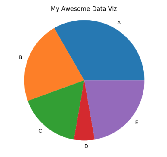
The output should look like this:
import numpy as np
from matplotlib import pyplot as plt
names = ['A','B','C','D','E']
percents = [33.3,22.2,16.7,5.6,22.2]
plt.pie(percents, labels=names, autopct='%1.1f%%' )
plt.axis('equal')
plt.title('My Awesome Data Viz')
plt.show()
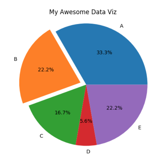
9.5) Highlight the second slice:
import numpy as np
from matplotlib import pyplot as plt
names = ['A','B','C','D','E']
percents = [33.3,22.2,16.7,5.6,22.2]
separate = (0,0.1,0,0,0)
plt.pie(percents, labels=names, autopct='%1.1f%%', explode=separate )
plt.axis('equal')
plt.title('My Awesome Data Viz')
plt.show()
Your result should look like this:You learned how to make three kinds of plots using Python!
To learn more about Python data visualization, check out matplotlib.org and Mode Blog .
Open Trinket